Your Ad Works Fine — The Landing Page After It Is Bleeding Money
The ad copy isn't your problem. The friction after the click — wrong pages, unreadable phones, missing captions — is where your budget actually disappears.

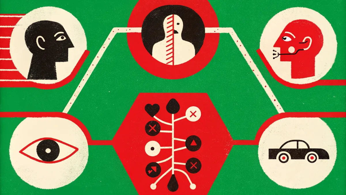
Do I understand the language? Every word on the page should come from your client's world, not yours. "Comprehensive brand positioning audit" means nothing to the person paying you. "We'll figure out why clients aren't buying and fix it" — that they understand.
The budget leak nobody checks: ad mistakes that happen before anyone clicks
You wrote the copy. Picked the visuals. Dialed in your targeting. Hit publish. Money's leaving your account — but clients aren't arriving.
Here's the thing: the ad itself is almost never the problem. The real damage happens after — when someone actually wants to engage and slams into friction you never thought about. We're talking basic hygiene. Stuff so simple it feels beneath you. But these invisible snags will eat more of your budget than bad copywriting ever could.
The gap between seeing and doing
You're a consultant speaking at a conference. Last slide — a QR code for a free strategy session. Fifty people in the room. How many actually pull out their phones and scan it?
Fewer than you think, and for reasons that have nothing to do with your offer. The QR code looks tiny on the projector. There's no label saying where it goes — and nobody scans mystery codes. The venue Wi-Fi is garbage, so the page hangs forever. Forty warm leads, vanished. Because you never tested that slide from the back row.
QR codes are everywhere — over 90% of marketers use them in campaigns, and usage jumped 433% between 2020 and 2023. But the real question isn't "should you use them." It's "can this specific person, in this specific room, on their specific phone, actually interact with it right now?" 82% of people will scan a code from a brand they recognize. Only 47% trust codes from someone they don't know. If you're a freelancer, a naked black square with zero context is dead on arrival.
Every offline touchpoint needs a gut check. Show it to a friend and time how long it takes them to figure out what to do. More than five seconds? Redo it.
Your screen is lying to you
You've got an iPhone 16 Pro on fast Wi-Fi. Your client has a two-year-old Android on 4G. You preview your landing page on a 27-inch monitor. Your client opens it on the subway, squinting at a 6-inch screen with the sun in their eyes. Different device. Different context. Different speed of decision-making.
Mobile accounts for 57% of daily online time, and two out of three online purchases happen on a phone. Mobile isn't "one of the options." It's the default — and if you're not designing for it first, you're designing for yourself.
Here's what you do: open your ad and your landing page on the cheapest phone you can find. On slow internet. Held at an awkward angle while you're standing up. If everything still works — you're good.
One ad, one promise, one page
A classic screwup: someone clicks on an ad for a specific service — and lands on your homepage. Or a Linktree with five different links. Or an "About Me" page with your life story instead of something they can actually buy.
This is message mismatch. The headline, visuals, and offer on the landing page don't match what the ad promised. The visitor's trust snaps, and they bounce.
The rule is dead simple: clicked on an ad for "$500 strategy session" → landed on a page that says "$500 strategy session" with a description and a "Book Now" button. If you're a freelancer with three to five services, this isn't a scaling problem. One landing page per service. With Leadpages or even a free Carrd site, you can build it in an evening.
The problem isn't technical. People are too lazy to make a separate page, so they funnel all their traffic to one generic destination and wonder why nothing converts.
Four questions your page must answer
Once someone hits the right page, it needs to answer four questions in under five seconds:
What is this? Not "creative design solutions" — try "web design for restaurants" or "email strategy for SaaS startups." Skip generic product photos. Show portfolio pieces, screenshots of actual results, a video walkthrough of real work you've done.
Why should I care? Not a feature list. A specific benefit tied to money or pain. Not "I build strategy," but "you'll stop wasting $2,000/month on ads that don't convert."
What do I do next? One primary CTA above the fold: "Book a call" or "Get a quote." Then secondary CTAs after each section for people who aren't ready yet — lower-commitment actions like "Download the checklist" or "See case studies."
The formula from taap.bio works well here: Header Block (who you are and who you serve) → service sections with FAQ → transparent pricing table → CTA buttons after every section. Same four elements, adapted for services instead of products.
Where they see it changes everything
You launch an ad in Instagram Stories. Someone's scrolling while waiting in line for coffee. They've got 1.5 seconds of attention. Your creative is small text on a pale background. They literally can't read it.
Or you're running a YouTube pre-roll to promote a webinar. The viewer wants to watch their video — you're in the way. Their finger is hovering over "Skip." You have 5 seconds to land a point. Not 30.
Or you make a video ad but forget captions. Someone's on the train without headphones. Your message is a silent rectangle they swipe right past.
Checking context got easier. Canva shows how your creative looks in Stories, Feed, or LinkedIn post format. Screenhance generates device mockups in seconds. No Photoshop needed.
Before you launch, drop your creative into the platform's real context. Is the text readable? Does the message land in two seconds? Does your visual stand out from the feed — or drown in a sea of posts that look exactly like it?
Five questions before you spend a dollar
Before you hit "go," answer these:
How long does this decision take? A $3,000 strategy engagement isn't the same as a $29 template. You won't sell a high-ticket service from a single ad. You need a chain: content → trust → easy first step → sale. Rushing that sequence is just burning money with extra steps.
**Is this convenient for them right now?** Are they on a plane with time to read a long article? Or scrolling through Reels on the go — and you're interrupting?
What device are they on? A big monitor where details are visible? Or a phone screen where anything under 14px is unreadable noise?
Will there be sound? If it's video — captions are mandatory. People watch without audio in public, at the office, in bed next to a sleeping partner. No captions, no message.
Are you running the same creative across all platforms? Posting identical content everywhere without adaptation is one of the most common mistakes in social media advertising. Even small tweaks — format, text length, CTA tone — make a measurable difference in performance.
From those answers, you build hypotheses. Then you test them. For tracking, Dub gives you branded short links with a UTM builder and precise conversion data. Works for ad links and event QR codes alike.
What this means when you're the whole company
Everything above hits harder when you're a solo professional. No marketing team to catch your blind spots.
Your "product" is you. The "product image" on your landing page is your portfolio, screenshots of results, a video testimonial from a real client. Not a stock photo of someone smiling at a laptop. People buy from people — show the actual work.
Your CTA is "book a call," not "buy now." Calendly, SavvyCal, Cal.com — pick a booking tool and embed it directly on the landing page. Every extra step between click and booking costs you clients. Literally. Each click in the funnel drops a percentage of people who were ready to say yes.
Social proof matters more for you than for companies. Nobody wants to take a leap of faith on an unknown freelancer. Client testimonials, company logos, specific result numbers — these aren't "nice to have." They're table stakes. No testimonials yet? Email your last three clients today. Two sentences from each is enough to start.
What doesn't work
Same creative on every platform. Instagram Stories — vertical, 1.5 seconds of attention. LinkedIn — horizontal, people actually read the text. YouTube — 5 seconds before "Skip." One visual across all three is a lazy move, and platforms punish it with lower reach.
Posting without a plan, just to "stay active." Random posts, then a week of silence, then three posts in one day. This confuses your audience and the algorithms. Three posts a week on a consistent schedule beats ten chaotic ones every time.
A landing page with zero social proof. Beautiful design, sharp CTA, but not a single testimonial, not one case study. The visitor thinks: "Who is this person?" — and leaves.
Multiple competing CTAs on one page. "Book a consultation," "Subscribe to the newsletter," "Download the guide," "View portfolio" — all the same size, all screaming for attention at the same time. The visitor picks none of them. That's not a choice architecture — it's a panic room.
Mismatch between ad and page. The ad promises "free website audit." The page offers "full-service marketing consulting." Trust evaporates on contact.
The uncomfortable pattern
Every ad mistake on this list comes down to the same thing. You're looking at your ad with your eyes, on your device, in your context. Your client sees something completely different.
Pick up your phone. Open your ad. Open your landing page. Pretend you're someone who's never heard of you — in a rush, in a noisy place, on a cracked screen with 12% battery.
If you can't tell what you're offering and what to do next within five seconds — you don't have a targeting problem. You have a hygiene problem. And no amount of ad spend fixes dirty pipes.